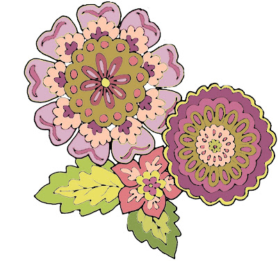
 Lesson Number One: Everything is always harder to do than it looks.
Anytime I have ever said to myself, "I can do that", has lead to a long and very laborious learining process.
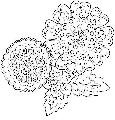
Here are my first attempts at creating interchangeable motifs for my new line of fabric for Adaptive Textiles. To me they are obvious, bunchy, and crowded but I have no objectivity when it comes to my own work!
 Lesson Number Two: It takes at least 10 or 15 try's at creating different color combination's in Photoshop before you find one you don't absolutely hate.
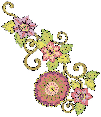
While the final renderings will be done in ink and watercolor, I decided to form the color palette in photoshop first as a guide - Smart move! I think it will save a lot of time and several levels of frustration.
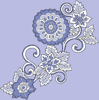
 This Studio 3.0 rendering of one of my drapery designs using the rough fabric mock up was made by the super talented Casey Green of Minutes Matter. It is great to be able to visualize the pattern in use as you are designing it.
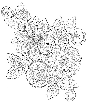
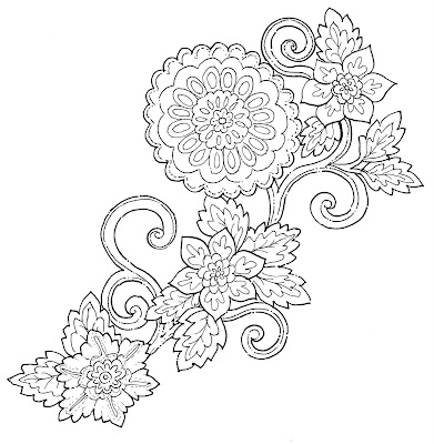
Lesson Number Three: Drawings look completely different in black and white than when they are colored in.
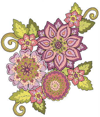
Lesson Number Four: This process may take me some serious time and effort before I figure out what I am doing! But it looks like it's going to be fun........


8 comments:
Wow, I'm impressed! I can't even imagine designing fabric...it would be so hard! Yours are beautiful!
Here is an objective opinion for you. Awesome!
Jay
I can't even begin to express my excitement about home decor fabric designed by someone that actually knows how fabric behaves!! This should be fun!!! Best of luck.
Bravo...I am so excited about your new venture. Can't wait until it's "ALL" available..
OMG...this looks so challenging...but you are the person to do it best Jackie.
If this is just the beginning, then I'd say you're off to a great start!
Keep us posted.
Michelle :)
You are so talented! I love the blues colourway you've done.
You're totally right about choosing colors in Photoshop... I usually find it easier to pick colors from my Pantone deck and use the corresponding swatches from Photoshop's Pantone Library.
Designing is the easy part. Wait until it comes to the back office part. Have a great time with it, your the artist and it's your work.
Post a Comment