I showed you the primary colors shown at market in my post about Purples and Mauves but there were also some emerging color stars that will take on more importance in the next couple of seasons. A glossy almost lacquered Black is the anchoring neutral for this collection of ultra bight heavily saturated accent colors.
One of the less vibrant color combinations in this palette is black set off with metallic silver or gold and accented with the same chartreuse green that we saw commonly mixed with purple and mauve.
Designers Guild
By grounding this intense color with the use of an abundant amount of black the finished effect is sophisticated an surprisingly soothing. Playing with texture, sheen, create motion and balance in the room.
Gaudarte
We saw the same chartreuse accented with white and the effect was an intensely vibrant and bright space.
Gaudarte
This color combination was not for the faint of heart but would provide for a happy and vital space.
Gaudarte
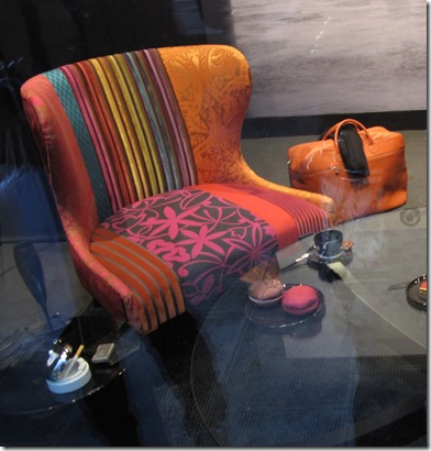
I saw quite a few bold combinations of pattern and color used on modern furnishings much like the traditional combination upholstered pieces we saw a few years ago. This new trend combined traditional fabric motifs in super bright color ways all arranged in asymmetrical pieces that showed off a high level of contrast.
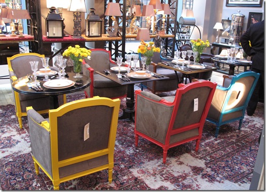
Furniture frames lacquered in super bright colors were neutralized with men's wear inspired woolen upholstery in various shades of grey and taupe. These pieces were set off with patent leather welting in various colors including black.
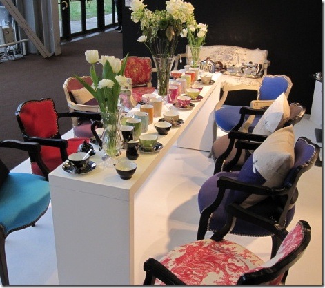
Another view of the back of the chairs. I saw many grouping of similar or very diverse chairs in assorted super bright grouped with small tables and set in a traditional dining room setting. Also worthy of notice is the rug used in this display. Seems there is a growing trend to repurpose old or surplus rugs by bleaching them. Bleach is applied randomly as on this rug or more uniformly on others to create a very worn look.
Another example of mix & match traditional patterns on a modern chair. This black and white beauty does a great job of combining fabrics with heavy texture, shine, and bold pattern.
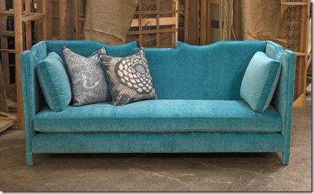
This years Pantone color of the year Turquoise, was present in this super bright color mix. Here a lovely turquoise sofa by Shine Home was a big hit at Maison et Objet.
Shine Home
Reflective surfaces are a key component of this look so we saw many fabulous products printed on or painted behind glass. I absolutely love this look!
Provence et Fils
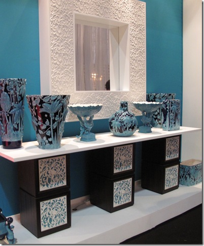
More turquoise mixed with high gloss black and white in high relief. Definitely Chinoiserie inspired I loved this vignette.
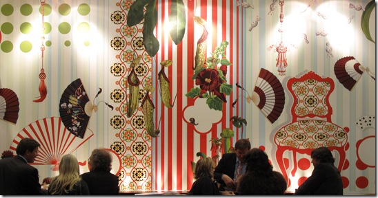
To go along with super bright furnishings we found super bright and super large graphic wall paper from Marburg.
Marburg
Another set of mismatched bright chairs in various finishes and styles.
The last color in this scheme is bright orange and I am talking serious Halloween or for you fashionistas out there, Hermes orange.
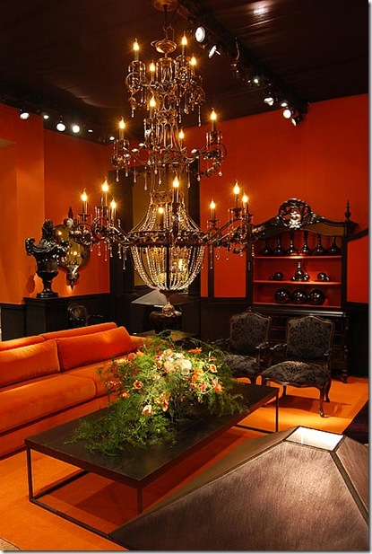
Tempered again with glossy black it is a strong statement to be sure. But one that I found surprisingly appealing.
This room really shows how intense the sheen is on the black furnishings and accessories.
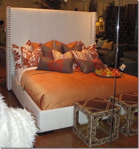
Orange was also paired with white for high contrast.
It seems that this emerging trend towards bright color and high contrast is the direct opposite of the dominant trend of faded grays, neutrals and natural products mixed with soft hues of purple and mauve and the highly textured woods like oak and teak use for case goods. Only time will tell what the “new” look will be but I’ll keep my eye on this palette. I think it has legs.
What do you think about it? Fan of faded, soothing, ethereal interiors or longing for some uber bright pigments to brighten your day.
Please leave a comment and let me know.







12 comments:
Not for the faint of heart indeed! (that made me laugh)
I am far too traditional (or conservative? not sure what you'd call it) to fully embrace the black and bright colors, but I do see the appeal. And for someone like me, there is always the option of using one bright color that you like for accent details and accessories. Like dipping your toe in the pool as opposed to the all out cannonball.
I also kind of wonder how long the bold patchwork chair upholstery trend would stay current. It may go the way of '80s splatter paint. Supposedly, that's making a comeback of course...but Eddie Ross approved wallpaper or not - I'm skeptical.
Bright Colors!---Bring 'em on! Lively and fun and happy!
The SHINE sofa is gorgeous---as stylish and glam as their case goods. Thanks, Jackie, for bringing a little of Maison over here!
Jackie, this photos are great. Some of these vignettes I remember seeing but I missed others completely. But regarding the bleach-splattered oriental carpet: all I could think was that HGTV show where your neighbors come in and have free rein to redecorate your home while you're away, and the bloodbath that would ensue if someone decided to bleach-splatter a valuable carpet without asking first... now THAT'S what I call entertainment! :-)
I love the turquoise sofa - beautiful lines, color, and texture - what a shining star! The chairs with the various fabrics placed in an asymetrical arrangement are fun. I think the designer would need an exceptional eye to make these work.
I have to say, the soothing, ethereal interiors for myself to live or stay in, but in public spaces like chi-chi restaurants & bars, I like the bold look like that orange/black combo.
Nice round-up ~ thanks for sharing!
There are some rooms in which I love bright colors (my office is an energizing coral) and others I prefer a bit more muted, or at least having richer colors. But I find that no matter the color scheme, I always like a touch of black in every room.
Hmm, I don't know which I prefer...
I usually go for the more muted colours but I wonder if I play it too safe because on the one occasion I went for it and painted a whole room vibrant turquoise I loved it, and it is more uplifting. I think maybe I was lucky there. That is probably what stops a lot of people - strong colour could go so right, but it could go so wrong. Muted is more predictable. But I am going to try not to let that put me off using lots of colour, maybe not the strongest shades as seen of some of those chairs.
I think sophisticated use of colour in wallpaper and fabrics can tempt people into using it more. Thank you for your insight into these trends, please keep us posted so that we can feel in the know!
what great photos. your blog is full of fun! so glad i found you
:)
What an interesting post. You definitly see the European influence. I love the high shine black, not a big fan of chartreuse, personally, but the room was striking. I, for one, am a color girl. I am happy to see that color is back, loud and proud!
I love the bright colors.
Thankyou for the peek at the Maison show - one I never get to see in person. While I personally love muted colors (all my years in DC) I'm becoming more and more Key West in my approach. I loved seeing the bright orange, turqoise and chartreuse featured as these are the big sellers in our shop and have not always been easy to find. For me, not so much the black. Maybe very chichi but not for Key West. That's what I love so much about your fabrics....new modern looking takes on traditional inspirations. Can't wait to get our samples! Jo
Oops, forgot to say how much I loved the turquoise chinoiserie vases. My definite favorite. Thanks for sharing.
Jo
Post a Comment